Branding — 2025
The Big You - Brand & Logo
Overview
John & Madge came to me for a brand to their co-founded spiritual alignment business, where together they bring clarity to their clients, helping them see & orient towards their purpose.
Details
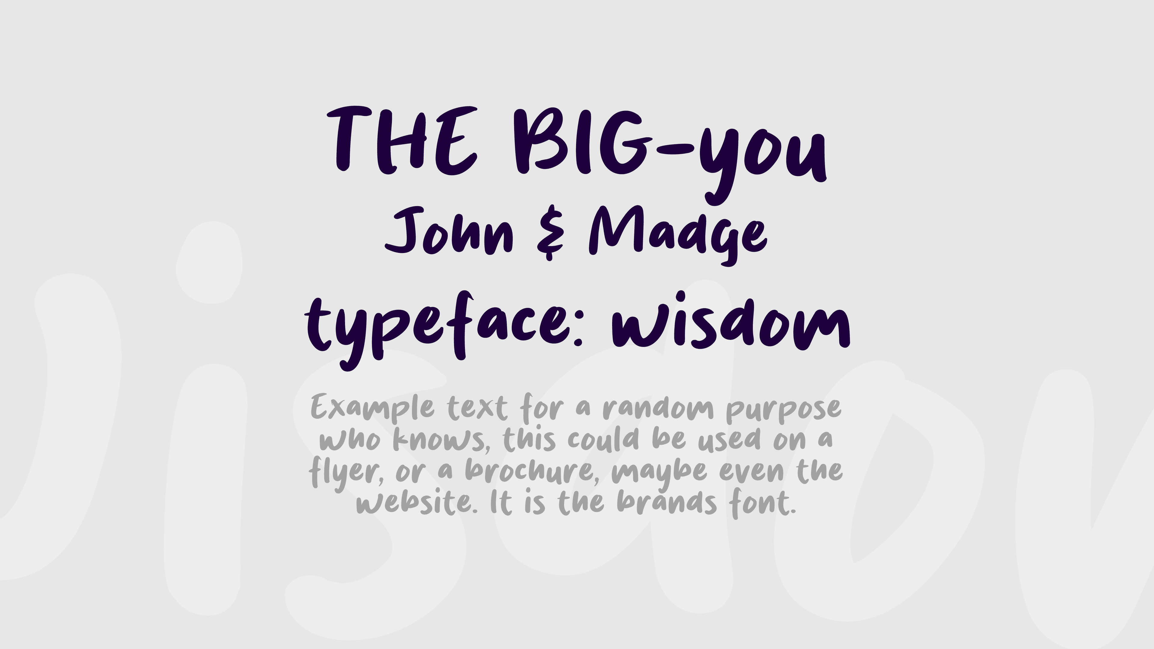
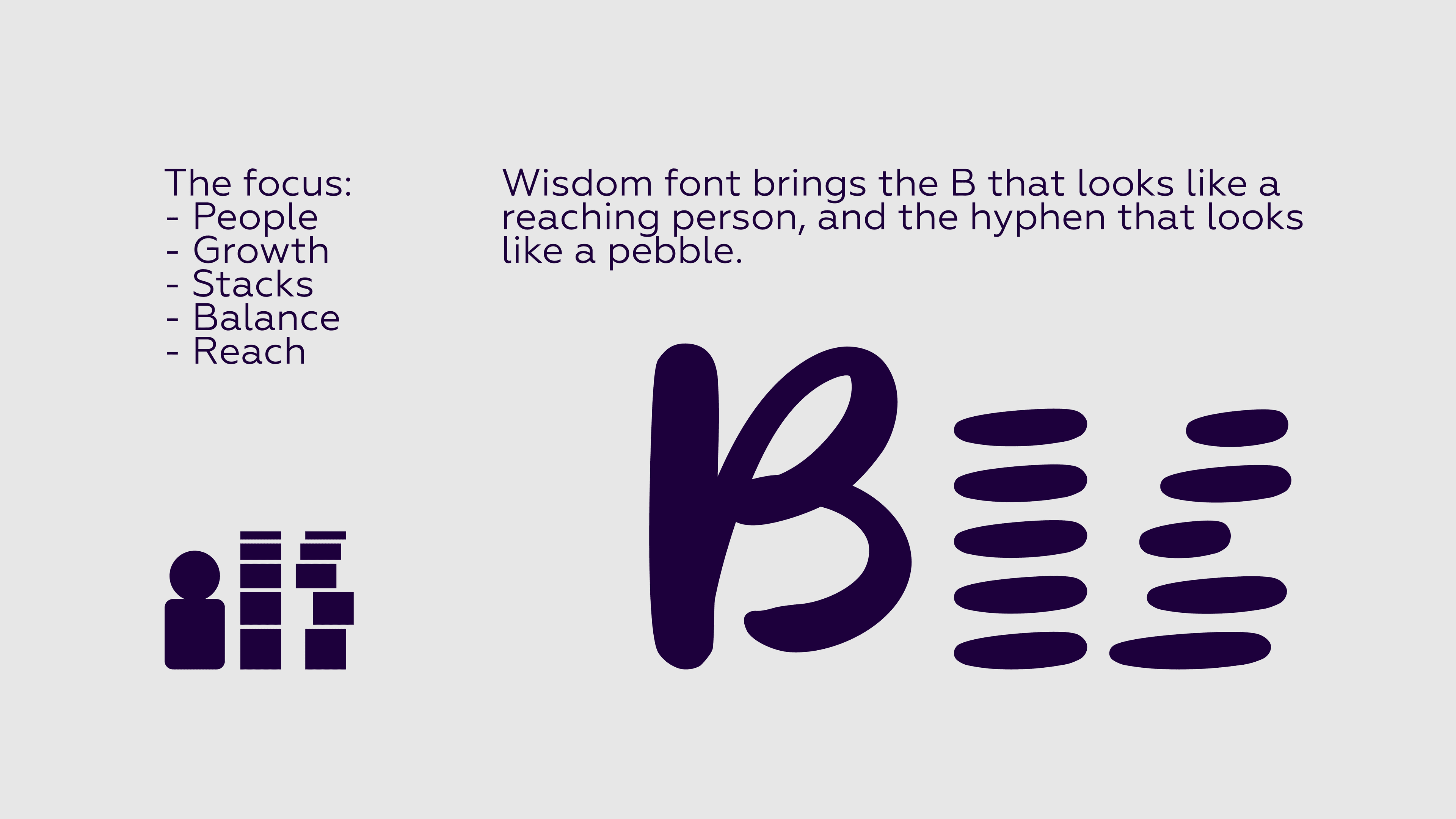
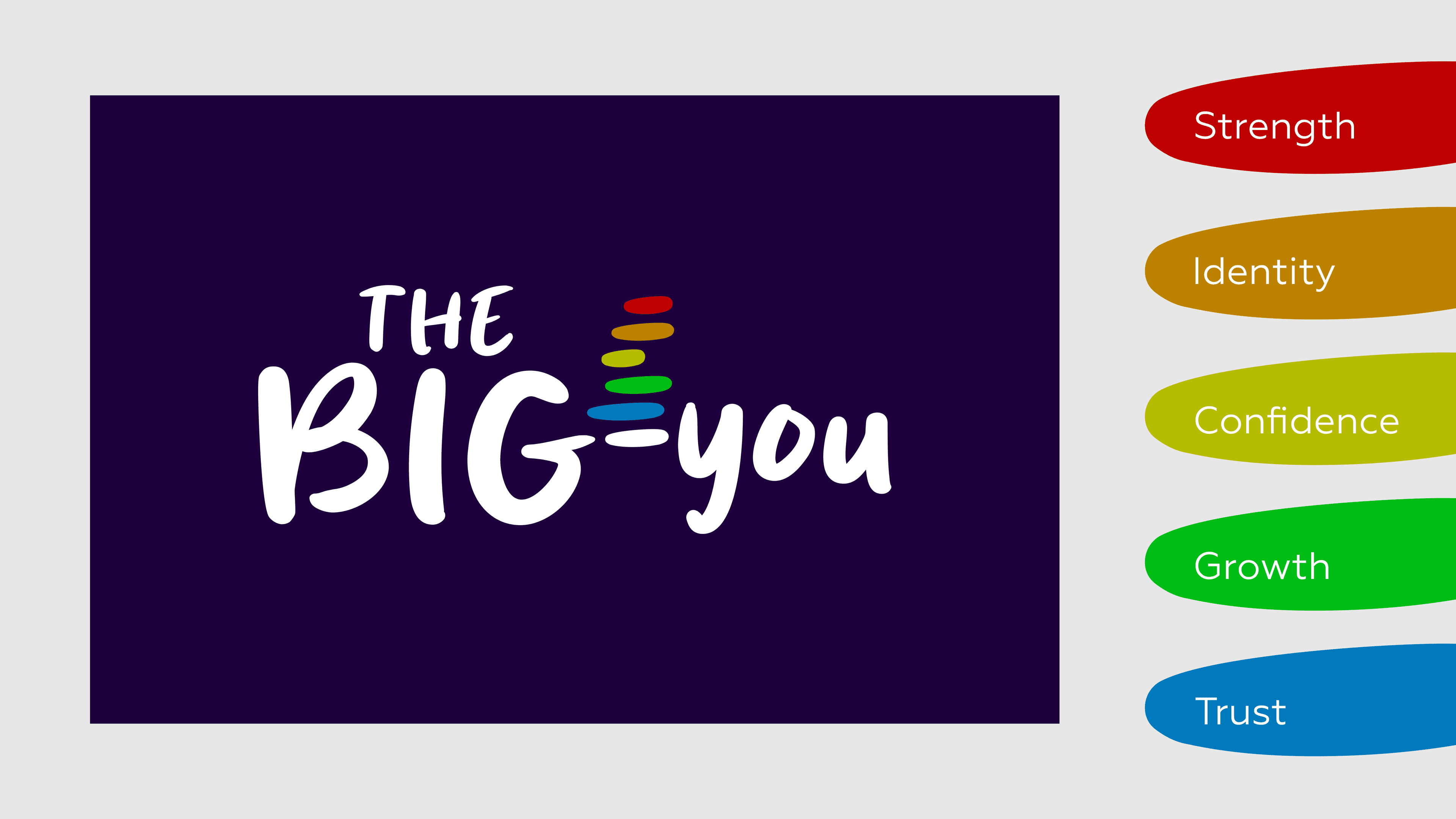
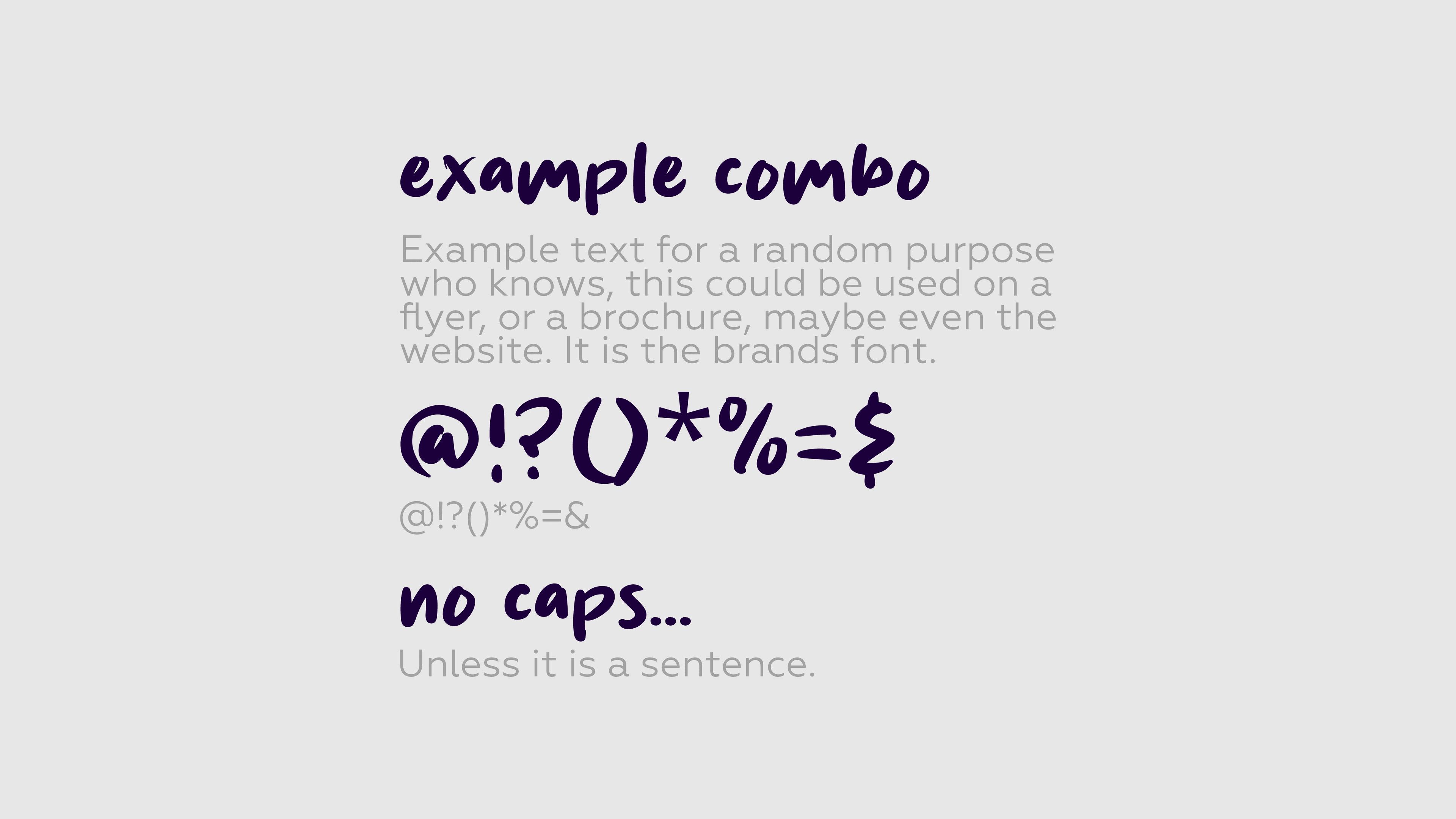
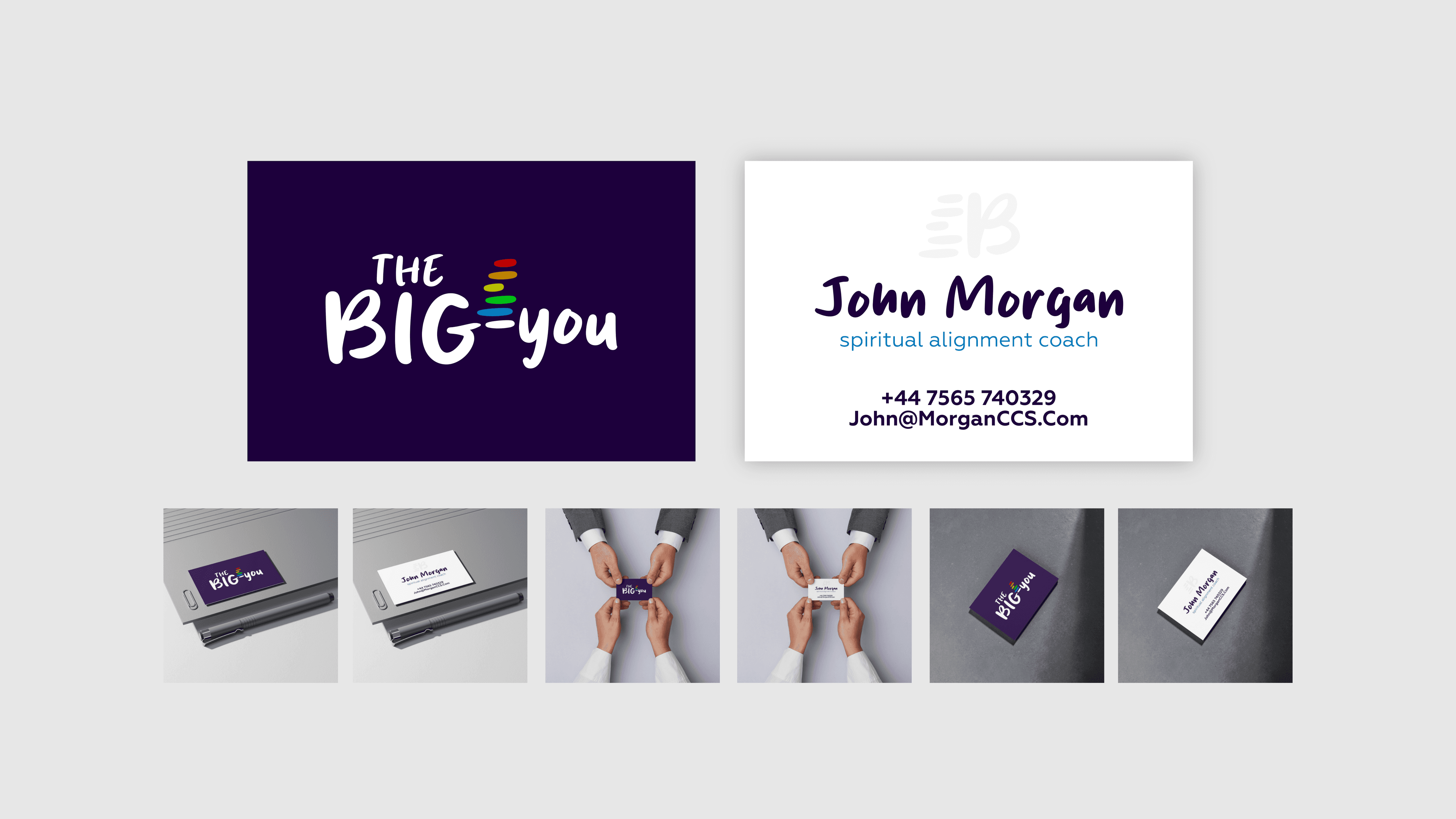
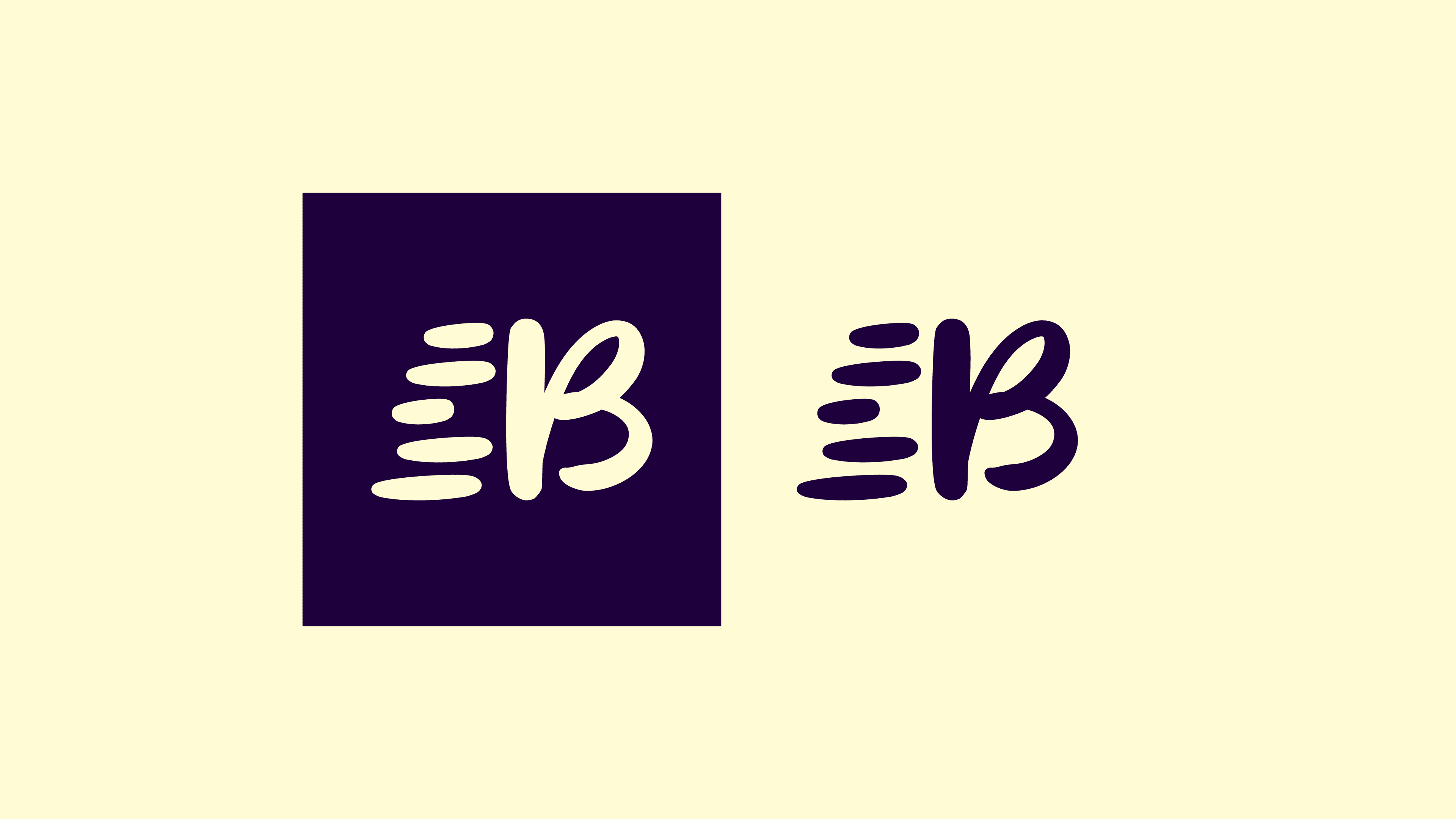
The main focus for The Big You, is bringing clarity by aligning you with your higher self. The main aim was to portray growth & balance. From the outset the imagery of the stacked tower felt obvious. However it wasn't until the typeface was chosen, that the brand was born. The font was called Wisdom, which was very fitting. It had a calm & rounded aesthetic which called the insinuation that not everything is as blunt & obvious as the world makes it out to be. Quickly the B stood out as a convenient shape of a person reaching up high, subsequently the hyphen looked like a simple pebble. The idea formed rapidly at this point, the stones balanced nicely next to the person aiming to reach their higher self. Adding a touch of colour, the stones were displayed in a spectrum from blue to red, starting from trust & moving between: growth, confidence, identity & strength; the main brand colour being a deep purple, perfect harmony of trust & strength.
Gallery